
What Radar 360 is for
Use Radar to move from individual returns to a cross-sectional reading: is participation broad or concentrated, does a sector stand out, and which assets deserve closer examination? Its role is to build a watchlist before opening detailed charts.
Coverage is limited to the assets returned by Crypto 24/24’s API. It is not the entire global market or a capitalization-weighted index. It does not display on-chain transactions, investor positions or capital flows.
Two independent settings: indicator timeframe and performance period
M5, M15, H1, H4 and D1 determine the timeframe of RSI, EMA, ATR and technical signals. The separate performance selector offers 24H, DAY (UTC), 1H, 15M and 5M and controls returns, colors, ranking and statistics.
24H is a rolling window; DAY (UTC) uses the start of the UTC day. 1H, 15M and 5M compare the available price with a historical reference around that horizon, not necessarily the current candle’s opening price. Return = (price / reference price − 1) × 100.
An H1 RSI and a 24H return are a valid combination: hourly momentum is compared with a daily rolling outcome. Keep settings and timestamps consistent when comparing assets or screenshots.
Color, size and position carry different information
Green means positive performance over the chosen period, red negative and grey zero. The rule applies in every view. A green bubble can have a bearish longer-term structure; a red bubble can retain a bullish one.
The default Performance magnitude size uses the absolute return: large losses can produce large bubbles. Uniform uses equal radii. Volatility (ATR / open) uses ATR relative to opening price. None represents market capitalization, traded volume or liquidity. Bubble radii are visually transformed, so areas are not proportional measurements.
Reading the four summary metrics
Observed universe is the number remaining after filters and required data checks, out of all received assets. Rising is the strictly positive share of that selection; zero returns remain in the denominator. Median performance is the middle sorted return, or the average of the two middle returns for an even count. Every asset has equal weight.
Broad positive participation and a positive median suggest strength across this sample. A few large winners with a weak median suggest concentration. After filtering for positive performance, the metrics describe your selection, not the original universe.
Latest candle close is the most recent close among received assets, derived from opening time plus timeframe duration and shown in local time with its timezone. It does not guarantee simultaneous freshness of all assets, prices or indicators.
Constellation: reading sector participation
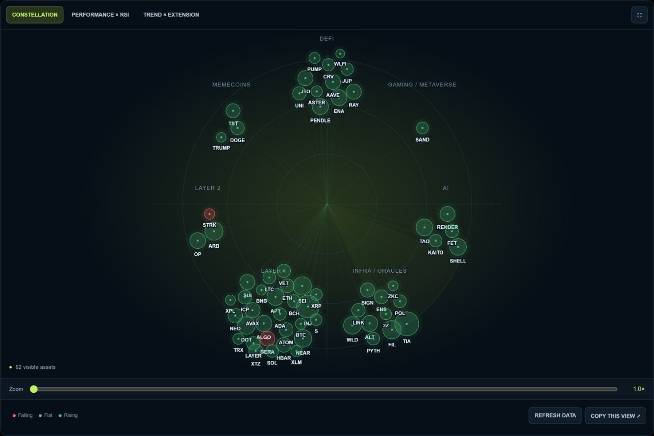
Assets are grouped into available sectors such as Layer 1, Layer 2, DeFi, AI, Gaming / Metaverse, Infra / Oracles and Memecoins. Angular position identifies a sector; placement within a cluster spreads out its bubbles. Distance from the center and proximity between assets do not encode return, correlation, risk or economic importance.
Start unfiltered. Does a sector have several advancing assets or only one leader? Select it, examine individual returns and compare 24H with 1H. Differences across horizons can motivate a rotation hypothesis, but cannot prove capital transfers, which the map does not measure.
Cluster size also reflects coverage: more listed assets do not establish a sector’s market weight. The rotating sweep is decorative, not transaction activity.
Performance × RSI: outcome versus momentum
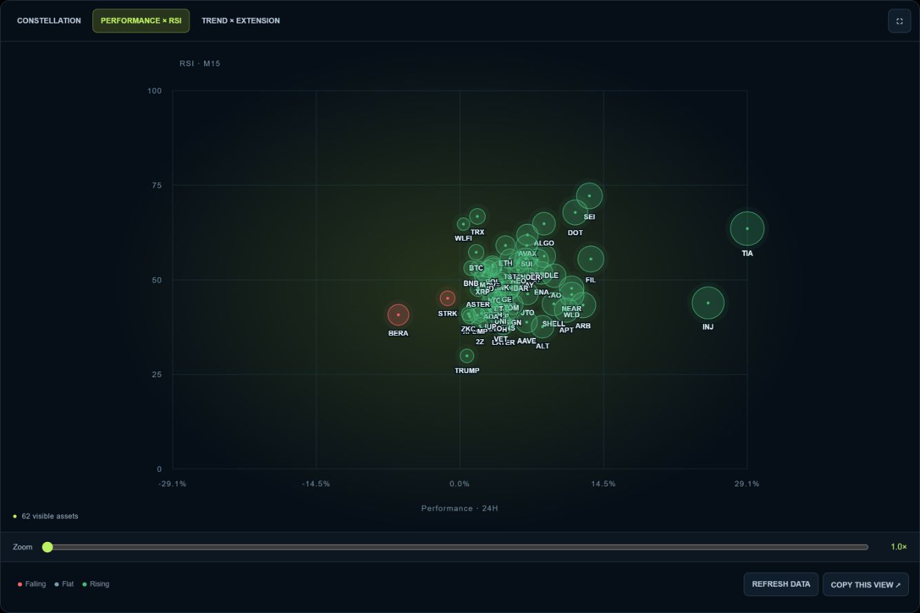
The horizontal axis is return over the chosen performance period: gains to the right, losses to the left. The vertical axis is RSI, from 0 to 100, on the indicator timeframe. This compares a period’s outcome with momentum on a separately chosen technical horizon.
Common RSI references are 30, 50 and 70. These are context markers, not automatic buy or sell instructions; extremes can persist during strong trends. A cross-sectional map does not establish an RSI divergence because it does not show the price and RSI history.
The four Performance × RSI zones
Positive return with RSI above 50 combines gains with stronger momentum. Inspect the chart before chasing an extended move. Positive return with RSI below 50 shows a positive outcome alongside weaker observed momentum: recent slowing or a difference in horizons may explain it.
Negative return with RSI below 50 combines weakness in both measures. Negative return with RSI above 50 can indicate a recent recovery within a still-negative performance window. It is a candidate for investigation, not a confirmed reversal.
Example: A returns +6% over 24H with M15 RSI 42; B returns +2% with RSI 61. A has the larger rolling-day gain, while B has higher M15 momentum. Neither observation predicts which will rise next.
Trend × extension: the exact axes
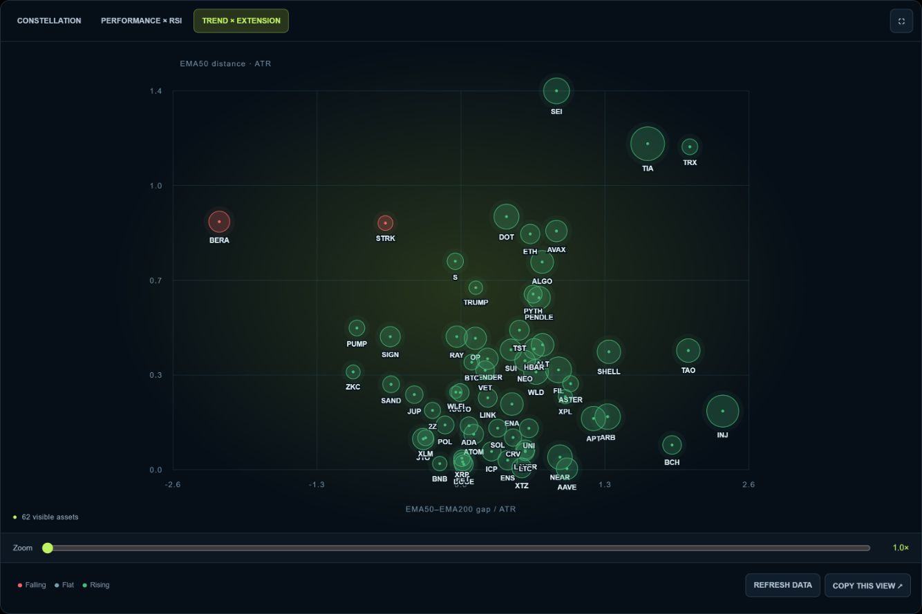
Horizontal = (EMA50 − EMA200) / ATR. Positive means EMA50 is above EMA200; negative means below; zero means they coincide. It measures normalized separation, not slope, ADX or the separate −1 / 0 / +1 structure code.
Vertical = |closing price − EMA50| / ATR. A higher bubble is further from EMA50 relative to measured volatility. The absolute value does not tell whether price is above or below the moving average.
ATR measures range, not direction or reversal probability. Two ATR is not a universal overheating threshold. Assets lacking valid EMAs or a positive ATR are excluded from this view.
The four Trend × extension zones
Lower right: EMA50 above EMA200 and price near EMA50, potentially consolidation or a return towards the average. Upper right: the same ordering with a larger distance; inspect the direction of the displacement and the risk of chasing.
Lower left: EMA50 below EMA200 and price near EMA50, which does not confirm a reversal. Upper left: the same bearish ordering with a large distance, potentially downside acceleration or an upward rebound. Absolute distance cannot distinguish these situations.
Example: EMA50 = 105, EMA200 = 100, ATR = 2 and close = 109 produce x = +2.5 and y = 2. A close of 101 also gives y = 2, despite being below EMA50. A detailed chart is necessary to resolve the direction.
Why filtering changes bubble positions
Numerical axes adapt to eligible assets. Performance × RSI keeps RSI at 0–100 but rescales returns symmetrically around zero. Trend × extension adjusts its symmetric horizontal range and vertical distance maximum.
An asset can appear to move or grow after another is excluded without its underlying values changing. Performance magnitude size is relative to the largest absolute return in the selection. Compare numbers and ticks, not pixels. Overlapping bubbles remain individually selectable from the list.
Basic filters: ask a precise question
Search matches ticker and name; sector restricts coverage. Minimum performance and RSI bounds narrow the question. Conditions combine with AND: every active filter must be satisfied.
Start with few restrictions and watch the remaining count. An educational example is minimum return 0%, RSI 50–70, H1 indicators and 24H performance. It finds non-negative returns with hourly RSI in that band, not recommended buys. Statistics are recalculated for the selection.
At the minimum performance and maximum distance endpoints, −∞ and +∞ disable the respective constraint. Missing required fields can exclude assets. The missing-data count does not include ordinary threshold rejections.
Advanced filters: distance, volatility and scores
Maximum EMA50 distance limits absolute distance in ATR. Minimum volatility uses 100 × ATR / opening price: 1 means ATR is at least 1% of the opening price, not a 1% return. Proximity to an average alone does not establish a favorable entry.
CS10 and DS10 thresholds filter technical and derivatives scores supplied by the API. They are neither success probabilities nor return percentages; Radar does not break down their components. Raising thresholds generally reduces coverage.
Too many constraints can hide context and isolate unusual cases. Reset periodically before testing another hypothesis.
Rising volume and structure events
Rising volume requires volume_up = 1. It is not a ranking by absolute volume, a liquidity measure or proof of institutional buying.
BOS / CHOCH / sweep requires at least one non-zero BOS, CHOCH, low sweep or high sweep signal. BOS denotes a structural break, CHOCH a change of character and sweep a liquidity excursion detected by the site’s logic. The checkbox does not require all events together and is not bullish-only. Inspect direction and chart context.
The asset panel and comparison with Bitcoin
Select a bubble or its list button to see price, return, BTC-relative performance, RSI, EMA50 distance, EMA gap, structure, volume and scores. The asset link opens its detailed analysis. The discrete structure code remains separate from the continuous trend axis.
BTC-relative return = [(1 + asset return / 100) / (1 + BTC return / 100) − 1] × 100. An asset at +10% against BTC at +5% has about +4.76% relative performance, not +5%. It compares growth factors over the same period, not correlation or necessarily the exact return of a tradable cross pair. An invalid BTC reference makes it unavailable.
A practical workflow from overview to watchlist
1. Reset, choose horizons and check candle close, count, rising share and median. 2. Use Constellation to identify shared sector participation. 3. Use Performance × RSI to separate the period’s outcome from technical momentum.
4. Use Trend × extension to examine moving-average ordering and price distance. 5. Add one or two filters and inspect remaining assets. 6. Open detailed charts to check structure, levels, liquidity and invalidation conditions before deciding. These views are complementary, not three independent confirmations: several variables derive from price.
Two reading scenarios, without automatic signals
Participation scenario: many assets rise, the median is positive and several sector members advance. Examine momentum and extension next. Broad strength does not justify chasing every green bubble.
Rebound scenario: a sector remains negative over 24H while some assets have short-timeframe RSI above 50. Compare H1 or H4 and inspect charts to determine whether a bounce is occurring within a bearish structure. Slower EMAs may retain their ordering during a quick rebound. A large red bubble indicates amplitude, not an automatic opportunity.
Zoom, refresh, sharing and saved preferences
Zoom below the map, pan after zooming and fullscreen improve inspection. Hiding symbols reduces clutter; the asset list stays available. Animate radar only controls Constellation’s decorative sweep.
Refresh data requests another site load, but caches may return an unchanged snapshot. This is not a tick-by-tick feed. Filtering is mainly local; switching timeframe can load another dataset, reused during the visit when available.
Copy this view shares settings, not frozen prices. A later visit uses then-available data. Logged-in preferences are saved through the site’s settings system. Reset restores Constellation, M15, 24H and Performance magnitude sizing, among other defaults.
Common mistakes and practical limits
Do not confuse color with trend, size with capitalization, sector proximity with correlation, or absolute distance with price direction. High RSI is not an automatic sell, low RSI an automatic buy. A snapshot does not show the path or event chronology.
Keep settings consistent and check timestamps. Prices and indicators can update at different rates; latest close is not a freshness audit of every field. A missing historical reference can become zero upstream, so 0% alone does not prove no movement.
Radar does not replace analysis of spreads, liquidity, fees, news or risk. It runs no backtest and executes no orders. Its value is to expose useful questions and focus the next analysis, rather than predict the market.
Read sector participation first, then performance and momentum, then trend context and extension. Keep horizons explicit, check values after filtering and inspect shortlisted charts. Radar 360 turns an overview into a reasoned watchlist.